Did you know there isn’t an exact conversion rate average in e-commerce? Simply because there are too many variables that play a role, and it also depends on the niche you’re in. But one thing is for sure, a good-looking website helps increase your conversion.
Do not worry about whether you’re up-to-par with any averages; instead let’s put the energy into improving the current conversion rate on your e-commerce site. Owning a domain, popping in images and listing prices on “sale” just isn’t going to cut it.
Getting your conversion rate up is hard. You don’t know why the customers abandoned your site, and you don’t know what they’re thinking.
Whether you’re currently struggling, looking to improve, or just beginning your e-commerce site, make sure to look at leaders for lessons. Using examples from well-known e-commerce stores, here are things you shouldn’t overlook or ignore.
Quality Over Quantity: Images
Humans process pictures within 13 milliseconds. Think about that for a second. Which is why quality images are super effective at helping convert.
Take a look at your store, are your images high-quality and relevant to your brand? Check out this brand Harry’s, who specialize in men’s shaving toiletries:
This is the main product page. When a visitor visits the page, one instantly knows their niche/specialty. The images are unique and crisp. It’s a detail overlooked, but because anyone who shaves knows the standard razor and blade sizes, by having it stand up against the shaving cream canister, it gives a relative idea of how big the canister is.
Because of the detailed pictures doing all the talking, there’s no need for extra and unnecessary text.
To-The-Point Product Descriptions
Sure, having a great picture will help with the buying decision, but product descriptions help seal the deal. One of the biggest mistakes we quite often see new e-commerce businesses do is using standard descriptions one might find on the label or box. A few things to always keep in mind:
- Author your own product description: it’s a marketing opportunity to help push the buyer across the finish line. Highlight what makes the product unique and have the description reflect your brand.
- Easy to read, short and sweet: this allows visitors to quickly scan and gain the information they needed to know. This will help reinforce their buying decision.
- Write it with your customer in mind: You want it to sound like your brand, but make sure it’s relatable to your target audience.
- Proofread: as with any other content on your site, get a second-eye to make sure you’re not publishing any mistakes!
Let’s take a look at a well-known retailer in the U.S., J.Crew who gets an A+ at product descriptions and high-quality phots:
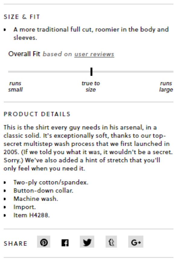
Their product page isn’t too busy and is straightforward. They take a minimalist approach by only having two photos. Read the product description, it really covers everything we just went over:
The product description sneaks in a background story on the process of making the shirt, adds a bit of brand personality, and everything a customer would need to know in a short and sweet manner.
Use Product Reviews
In the example above, J.Crew based their “Overall Fit” of the shirt from user/customer reviews. Often customers will trust the experience from other customers. This helps with transparency and helps instill trust and adds value.
It’s true not all reviews will be positive. However, negative reviews help you spot problems you may have not known about, like quality issues. Take negative reviews and respond to them in an appropriate manner. If you see a trend for a product, fix it by working with your manufacturer or replacing it with another similar product.
Leverage GrooveJar’s review widget, GrooveKudos where you can upload reviews and display them on different pages of your site. It’s possible to create one for each product and display it only on that specific product page.
Offer Free Shipping
This is hard to avoid, it’s become the thing to do. Your competition is doing it. Amazon is doing it. You should do it too. As a small business, it sure can influence your overall profit margin.
But here are a few things you can do:
- Build the cost of shipping into your products
- Make a minimum purchase order: But keep in mind of your product price points. If you’re selling items averaging between $5.00 to $10.00 – you shouldn’t have a minimum purchase order of $100. Be reasonable, honest, and fair.
- International Shipping Costs: state in your shipping policy the customer is responsible for all customs and taxes when you ship internationally.
- Charge a low-flat rate: despite purchase amounts, when there’s a low-shipping cost, it’s often overlooked and unnoticed
- Consider using a GrooveJar pop-up to incentivize visitors: subscribe and receive discount + free shipping.
Mobile Optimization
Not sure why we have to say this – Make sure your site is mobile optimized! This is in part a no-brainer, but there are small businesses who still don’t have a mobile optimized site. More and more people are on their smart phones, clicking through, and browsing. Mobile commerce is continuing to grow and playing a role in the customer journey.
Go on your smartphone, head to your website, you should not be needing to zoom in and out to read information or to click on links.
Check out Nordstrom’s website on mobile – It’s clean, easy to navigate, and even has a banner stating “Free shipping. Free Returns”.
Conclusion
As you can see the overall trend here is creating a user experience that works on all avenues, whether it be desktop, mobile, or tablet, being consistent is key. Which is why even customizing your GrooveJar pop-up to meet your brand’s aesthetics is also important, and your mobile site will look good as GrooveJar is mobile optimized.
So, what do you do next to build a core foundation to help combat a low conversion rate? Here’s a check list:
- Get/take high-quality photos for landing pages and products
- Test out shipping costs
- Write proper product descriptions, get them proofread
- Mobile optimize your site
- Customize your GrooveJar apps to complement the site
This is probably the first step to setting a successful foundation. Although different businesses tackle areas in different ways, for e-commerce businesses having a streamlined site and building an initial email list is always a good start.


No comment yet, add your voice below!