Branding is non-negotiable in our book. While we like to work quickly, we have learned the value of a brand over the years and so when people come to us for advice, we typically start there.
Funny enough, entrepreneurs often get hung up on a ton of things…
Should I register my company…?
What tools do I need…?
How many virtual assistants should I hire…?
All before they have made a single sale.
But when it comes to branding or what customers actually see and interact with, often times we see entrepreneurs shrug off the details.
We have heard everything from “well… this is just my MVP” to “I really can’t afford a designer so I hired my son’s babysitter who took a design course to put together my website.”
And they go with it.
But that’s not how this works…
So what is branding?
When I say branding, most people immediately think logo… but logos are actually one of the lowest things on our branding to do list. Yes, a great logo is important, but it doesn’t need to be super complicated or clever. It needs to clearly state what you do without being distracting.
For us, there are 3 key components to building great brand… design, copy, and product. Without these being in alignment, you don’t have much of a shot to succeed.
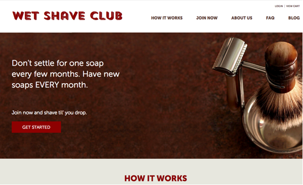
We saw this play out in real life with Wet Shave Club. When Kevin and Rohan first bought the business, the idea was there but the execution wasn’t. By revamping it (you can read the full case study here), they took it from an idea that made a few hundred a month to a company making 6 figures in revenue in 6 months.
SIX FIGURES: Got your attention now don’t I?
So let’s get down to what you need to take your business from an idea to an actual brand.
Since most people will spend less than 15 seconds on your website and because the average adult attention span is a mere 8 seconds, you need to have a game plan for when people land on your site. And the most important game plan involves a great first impression that extends all the way through your brand experience.
- Have great design.
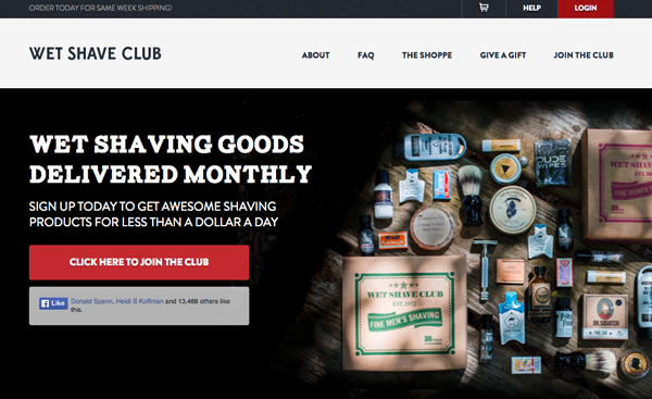
Great design is more than just pretty colors, it’s a conscious effort to build something that appeals to your target market. For example, a website for bikers probably shouldn’t be pink. Your hero image (the big picture at the top of your website) should pbe of someone in your target market smiling or of your product or service looking incredibly appealing. Your design should have breathing room, but not too much white space.
Ultimately, we usually recommend a designer because there is a lot that goes into a successful UX (our next blog post will talk about how to hire a designer on sites like 99designs or Upwork).
- Write great copy
Again, 8 seconds to capture your user’s attention. 8 short seconds to tell them why they need you or at least why they should keep reading. And if they keep reading, you have an additional 7 seconds to get them to act (just typing this makes me feel overwhelmed).
Capture them with banner text that addresses a need or a feeling. Make them question whether they need you. If they are questioning whether they need you, human psychology says that they will keep reading because people don’t like to leave questions unanswered.
When you answer the question, do it in language that is easy to understand and uses the least words possible. Often times we see people who have paragraphs and paragraphs on their web sites known as the wall of text. They think that if they tell you everything about every feature you will convert, but that’s often not the case. Bullet points and short digestible thoughts that ask users to take action almost always perform better than long, length paragraph-filled pages, so keep is short.
- Use credibility and social proof
Now this is where Groovejar comes in. How many times have you bought something based on a friend or celebrity’s recommendation?
Pretty often most likely.
According to research 70% of buyers look for reviews before purchasing. If your website is a blank canvas of stock images with no sign of actual life, people will not trust you and you won’t see conversions.
Use pictures of yourself, your business and your customers (faces with testimonials work well) to improve your conversion rates. Also using logos to convey credibility has long been a great way to instill confidence in your product. Even if you weren’t featured in the New York Times, putting “As reviewed by Yelp” with the logo can be a game changer when it comes to credibility.
There are also two apps in the Groovejar portfolio that specifically help with credibility…
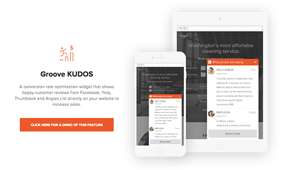
Groove Kudos is an easy way for people to see real reviews about your product/service from places like Angie’s list, Thumbtack and Yelp while Groove Hype is a great way to inspire action by showing what others are buying.
Both live right on your website which is important because your main goal is to keep your visitor there long enough to have them become a customer. When they go search for your reviews chances are high that they will see other company reviews and fall down the rabbit hole never to be seen again. Keeping your visitor present with buying intent is the best way to convert.
So what’s next?
Look at your branding. Are you compromising on any of the three key components we listed above? If you are, you are losing the game. With the internet, all you have is your storefront and it needs to make an impression 24 hours day. Branding is credibility. Its the proof people need that their credit card information won’t end up on the black market or that your product isn’t a lump of coal.
In future articles we will talk about testing to increase conversion (because there is always room for improvement) and will give you a step-by-step guide on how to hire the right designer from places like 99 Designs. But for now, install Groove Kudos and Groove Hype and don’t miss out on the credibility your visitors crave.


No comment yet, add your voice below!