
One of the first things I learned as an entrepreneur is… if you don’t ask, you won’t receive. Exit intent pop ups follow this same principle. While you may not have been able to seal the deal the first time around, asking them to give you a second chance before they leave is better (and cheaper) than hoping they see your ad again and stop back to say hi.
An exit intent pop up’s purpose is simple… focus the user on a single action and force them to make a choice. Asking them to make a decision makes them consider what they may be missing out on and the fear of leaving something behind means that if your offer is on target, your visitor is more likely to give you an immediate second chance. In fact over 70% of shopping carts are abandoned and exit intent pop ups help recover up to 15% of those carts.
But abandoned carts aren’t the sole purpose for exit intent pop ups. Using technology that recognizes when a mouse is traveling towards the outside of the browser, these pop ups can be your last ditch effort to salvage a potential relationship.
Let’s look at 5 exit intent pop ups and their unique strategy to increase your bottom line.
1. List generation: the I-know-we-just-met-but-I-would-love-for-you-to-get-to-know-me-better pop up
Getting someone to trust you enough to make a purchase is often times like dating. After meeting someone, you don’t just get married the next day… typically, you find out how to contact them, have a few phone conversations and maybe a date or two before they’re all in.
Purchase decisions often times follow a similar path. If your buyer isn’t quite ready to purchase, getting a mini-commitment from them (like getting their email address in exchange for something of value from you) is a good first step.
What it should look like:
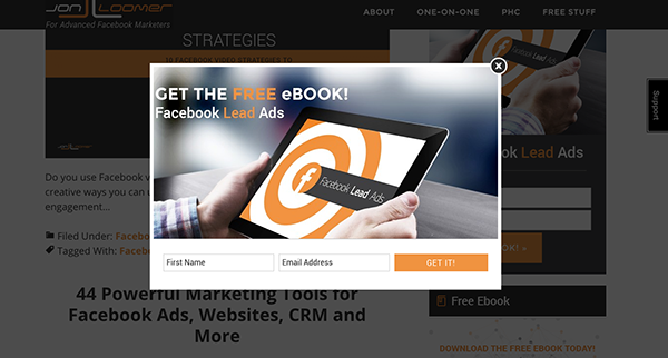
This pop up is a lead or list generation pop up. Because people are in the process of exiting they may be leaving because they are unsure about you. In order to gain the trust that you need to get their information before they leave, you need to clearly state your intention for gathering their info, make the exchange valuable for them and you need to be clear in what and how often they will receive something from you. This could be anything from a report that will show them benefits that are attached to your product or weekly emails from the founder. Whatever it is, there needs to be an even exchange of value.
2. The Reminder: the you’re-leaving-something-good-behind pop up
For me, nothing hurts worse than the abandoned cart stat on my website. It’s the “they slipped through my fingers” feeling that is incredibly hard to shake. Getting so close and losing a potential buyer means that they want your product but something happened before they pressed the pay button. It could be that your potential buyer became overwhelmed and couldn’t make a decision or that they simply became distracted. Interrupting their exiting action and reminding them to complete their action can result in carts recovered and skyrocketing sales.
What it should look like:
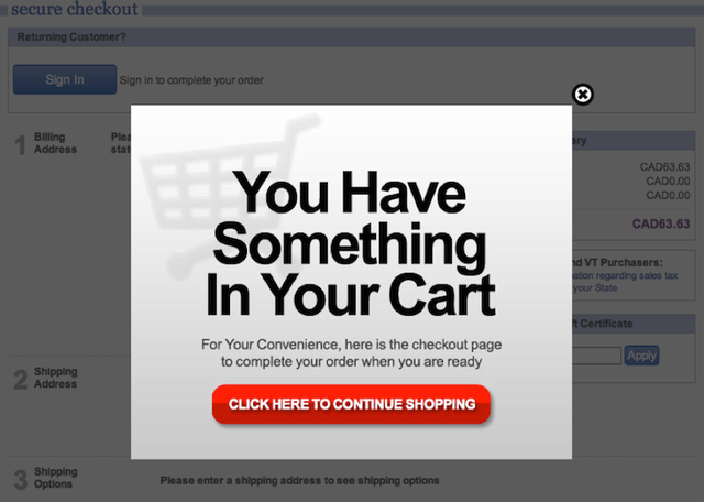
You don’t have to interrupt their action with an offer. Simply reminding visitors that they have an item in their cart can trigger a pattern interrupt which can break the sequence of their actions and get them to consider why they are leaving.
Another tactic to try is to offer or mention support. Your visitors may have doubts or trouble completing checkout and offering support as they exit may give them the confidence or trust in your site that they need to complete their purchase.
3. The Offer: wait-I’ve-got-something-super-shiny- that-you’re-going-to-miss-out-on-if-you-leave pop up
The offer exit intent pop up is purely psychological. People love to be offered discounts. They love to feel like they are getting a deal and even if they are racing towards the exit, an offer can keep them from clicking the back browser button.
Oftentimes people leave your site to find a coupon. By not offering them a discount when their cart is full and they are exiting, you’re playing a game of Russian roulette. When a visitor leaves, your best-case scenario is that they find a coupon and return (but then you’re most likely sharing a hefty commission with an affiliate)… Your worst-case scenario is that they have navigated away, found your product at a better price or moved on to other things.
What it should look like:
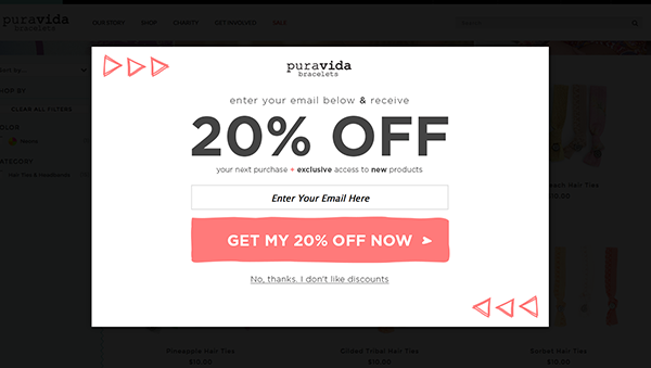
The offer should be clear and concise. It can provide a discount or promote scarcity but whatever you offer should be accompanied by a strong call to action that directs the user to complete their purchase. The offer should trigger the fear of missing out on something incredible. Remember though, if you’re going to offer a limited time coupon or something of that nature, try to truly make it limited so you don’t lose credibility with your potential buyers.
4. The redirect: don’t-leave-there-is-even-better-stuff-behind-door-number-two pop up
Your visitor may have landed on your site, consumed your content and is ready to leave without taking any action. The redirect is a great way to increase time on site and potentially get a purchase.
What it should look like:
Perhaps you have a blog post that is similar in content to the one your visitor has just read, why not keep them on your site with another amazing, relevant article. Or, maybe your buyer isn’t sure about making a purchase… instead of allowing them to exit stage left, direct them to a blog post that talks more about the benefits of your product.
For example, if I wanted to buy a microwave and I’m looking at my options and there is choice to be made about CPU’s, cubic dimensions, plate size and more… I am most likely leaving because I’m overwhelmed and don’t have the answers. Instead of allowing me to leave frustrated, directing me to a page that explains the ins and outs of microwaves with a buy button at the end, is a content-driven way to keep interested buyers from leaving.
5. The Survey: tell-me-what-you-want-from-me pop up
Your visitors may leave because the message you are presenting to them is not properly targeted. They may also leave because you don’t have what they want. Or maybe they love what you have, and you want to offer them more value…
The only way to find an answer for questions like these is to ask. People generally like helping to improve products for the greater good, so an exit intent pop up is a free way to collect useful data.
What it should look like:
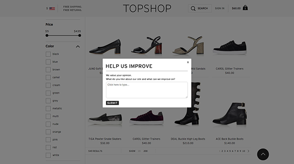
If your time on site or cart abandonment is high, ask your users why on exit. While you may not be selling something, learning why people are leaving is invaluable and can help you improve your message, pricing or any other variable that may be affecting your conversions.
Similarly, if you have a product that you’re considering developing for your market, asking your visitors relevant questions on exit will give you insight and is a free way to validate an idea.
So you need an exit intent pop up… how do you get started?
When we talk about exit intent pop ups, we aren’t talking about those spammy, bland, gray pop ups that everyone remembers circa 1997… we are talking about well designed, fully integrated pop ups that inspire action. It may sound super complicated, but it isn’t. It’s as easy as signing up, designing your pop up and adding a simple line of code.
While we of course use Groove Jar, a suite of optimization tools specifically built to help small businesses turn their visitors into customers, the most important thing about exit intent pop ups is to take action and get one. Everyday you don’t have some sort of exit intent pop up is more visitors you are allowing to leave your site without potentially converting them into a customer. Most likely you are working hard for that traffic, so increasing your odds with an exit intent pop up should pretty much be on every small business’s must have list.
Have questions or another unique way you use exit intent pop ups? Comment below, we are all ears.
No comment yet, add your voice below!