
Starting and growing a business is intense.
There’s so much to consider. Design. Traffic. Conversion rate optimization. Systems…. and the list goes on.
It’s a hell of a lot of work, but it’s also exciting and unpredictable. For most of us it becomes a passion project and is in many ways akin to raising a child.
When it comes to “raising” your business into a self-sufficent big boy or girl, there are many areas you must focus on. It’s difficult to choose the most important thing at the most important time.
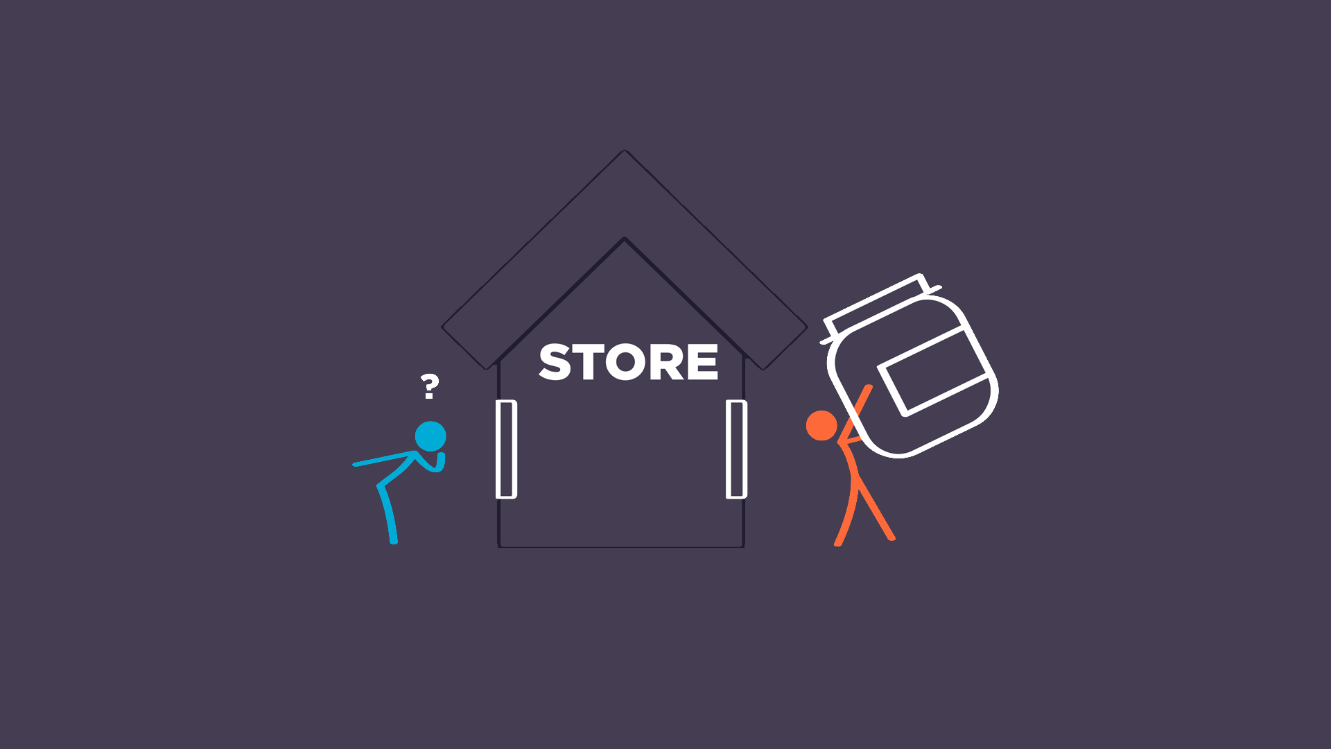
Without question, sales is the lifeblood of your business.
Without sales, there is no business. Processes and systems are critical for scaling, but sales must come first and foremost!
The sales process starts with bringing high quality traffic to your site. Traffic is important, but what’s even more important is what you do with that traffic once it arrives on your site. Conversion rate optimization will make or break your business.
You can’t afford to waste an opportunity to provide value to a single visitor of your site.
Traffic is the currency from which your business will grow. You must nurture and care for it. You must serve your visitors and help them along in their buying journey. What you sell and the value you provide must be immediately obvious.
Remember, there’s a reason your visitor’s on your site. They’re there for something. They have certain expectations when they reach your site and if you fail to meet those expectations they’ll leave (quickly)!
First impressions are critical! Let’s go on a journey into the mind of a visitor to your site…
The term, “before the fold” means the portion of your website visible to the visitor without scrolling. This area of your site is by far the most important. It’s the first impression.
In the real world of human to human interaction, a good first impression with another human tells you so many things. Do I trust this person? Do I understand their intent? Are they confident? Weak? Creepy? Happy? Cheerful?
In the world of the web, first impressions matter in an equally important way. People buy with emotion, not logic. Your site convey’s a lot more than you think. Good or bad, and whether you like it or not, your site triggers emotions in your visitors. It’s up to you to control what those emotions are.
Let’s look at some examples.
Positive Examples:
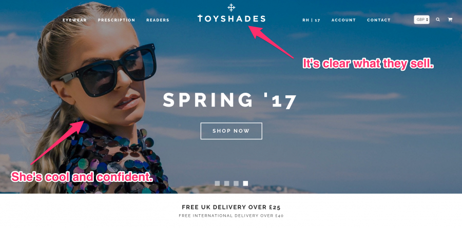
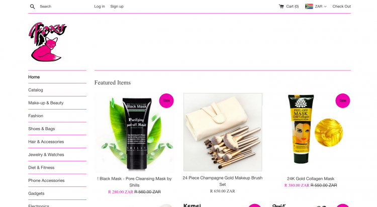
This site immediately conveys what they sell. The woman in the picture is attractive, confident, and bold. The emotion conveyed is, “I want to be like her.” The inference is, “Buy these shades and you will!” The site is also clearly current, as it discusses Spring ’17 styles. This implies it’s fashion forward and modern–that it’s cool, even.
There’s a call to action in the middle of the page. The visitor can get right to work acting on these emotions by clicking the “shop now” button and it’s all before the fold.
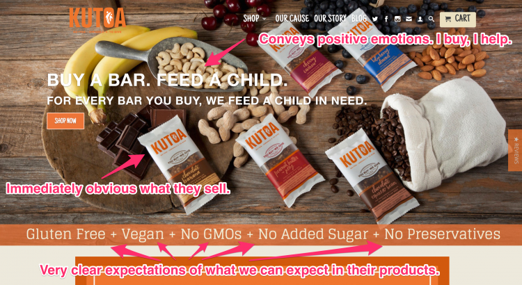
This site nails it on several levels. First off, it’s immediately clear what they offer for sale. Featured prominently is, “Buy a bar. Feed a child.” This makes the visitor feel warmly about the company. They think, “This is a good company, they give back. I’ll feel good buying these bars because I’ll also be helping contribute to children in need.”
Another key element present is the listing of Gluten free, vegan, etc. This is important because people that eat in this way identify themselves in this way. In other words, “I’m Vegan. This bar’s made for me and I can identify with their mission.”
It becomes more than just nutrition but a social and values connection is forged here too. Connections are made. More warm feelings from the visitor to the company. Lastly, there is also a call to action, “Shop Now,” before the fold. Tell them what you want them to do!
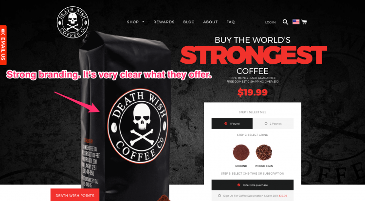
The branding here is bold and in your face. What they sell is obvious. And, who it’s for is obvious. This says, “Are you tough enough to drink our STRONG coffee? If not, get the hell out!” While some visitors will do just that, the ones who stay will strongly identify with the brand, thinking, “Yes. YES! This is for me.”
It creates the emotion of, “I’m strong and powerful, thus I drink Death Wish Coffee!” It forges a connection with the visitors by identifying the type of people who’re into this. “I am a strong coffee drinker.”
Negative examples:
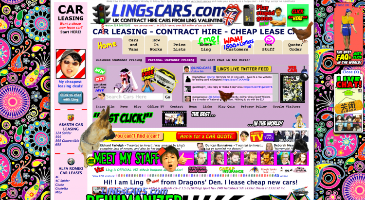
This is mostly for comic relief, but it’s an amazing example of a terrible site! All jokes aside, what you need to look out for is having a site that’s so busy your visitor doesn’t know what’s going on or what you offer. We repel ugly and they’ll leave as fast as they can! It’s just too much. Stimulation overload!
Make sure your site design is clean and neat. Spend the money on a professional design and people will spend money on your site! More on this below…
This site is too plain and un-engaging. What they’re all about isn’t immediately clear. There’s no call to action visible. The design is poor. Bottom line, when you see it you just want to leave.
You know the, “Dry, watery eyes…” guy from those TV commercials? This site makes me think of him. Boring! Nobody enjoys boring. Life’s too short for boring.
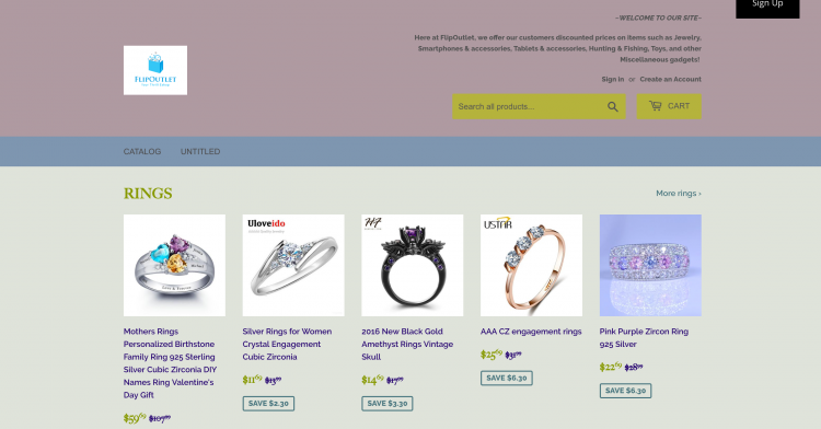
The design of this site is too 90’s. It’s not engaging, sexy, or even interesting. They sell rings, clearly, but what makes them different? What’s their edge? What are they about?
***Five takeaways to get the most from every visitor***
Make sure your design is spot on.
Pay for a good design from a professional. It’s worth every penny. People make a decision to go further into your site within seconds of opening it. If your design is bad, they’re gone! Are you serious about your business? Prove it by having a killer design.
I recommend using 99Designs. Rohan Gilkes, co-owner of GrooveJar and many other successful ventures made a free video course on how to rock your 99Designs contest. You can find the first video of that series here.
Make sure it’s immediately clear what you sell.
You’re not playing a game of 21 questions with your visitors. Leave absolutely no doubt in their minds what you’re selling! You can’t afford to miss this. Miss it and they will never get below the fold of your site.
Our attention spans are short these days. Your visitors need to know immediately if your site’s for them. If they can’t figure this out in five seconds they’re gone. They won’t look further. Gone! Goooooone!
Convey powerful and positive emotions before the fold
I can’t say it enough: This real estate is the most critical. A “hero image” is one placed at the top of your site. It’s the first thing a visitor sees. It’s their intro. It determines what emotions they’ll feel.
What’s your brand about? Make sure your hero images nails this. When visitors hit your site there should be a, “Hell yeah!!” moment as they relate to your brand. You want them to think, “This is for me!” If they don’t feel that, you’re either marketing to the wrong folks or your not conveying the message via your hero image.
Always include a strong Call to Action (CTA) above the fold
What do you want your site visitors to do? What’s the point of your site? For most of us it’s sales. We want them to buy stuff! So ASK them to!
“Join the Club,” “Shop Now,” “Join the Tribe…” Whatever it is, ASK! You’re the leader of your site. Guide your visitors to where they should go next. Make the decision easy.
Collect emails. Collect emails. COLLECT EMAILS!
Each and every visitor is extremely valuable. Their attention is your best chance of success. While you have their attention (and you likely won’t have it long) capture their email so you can ask for their attention again.
If your visitor leaves without giving you their email you have no say in capturing their attention again. If you have their email, you can reach out to them, provide value, and nurture the relationship.
We have a tool to accomplish this that converts five times better than the average popup and it’s called, “GrooveUrgent.” It’s built-in timer uses the power of psychology and compels your visitors to give you their email address. Conversion rate optimization on steroids!
In addition to this we have a built in tool, “Collect and Convert,” that takes these collected emails and works to convert them to paying customers. Emails = Revenue. They’re valuable! Don’t miss this opportunity to captivate their attention on your terms.

No comment yet, add your voice below!