
It’s a tough task running an e-commerce business. It’s difficult to know exactly where to start and everyone recommends a different strategy. But one thing is for sure, email marketing works and is king!
Here are some cool statistics in regards to email marketing:
- There’s a return on investment of $44 for every $1 spent.
- Visitors who come from emails spend more time than direct traffic (188 seconds).
- 80% of marketers in the U.S. use email marketing for customer retention and acquisition.
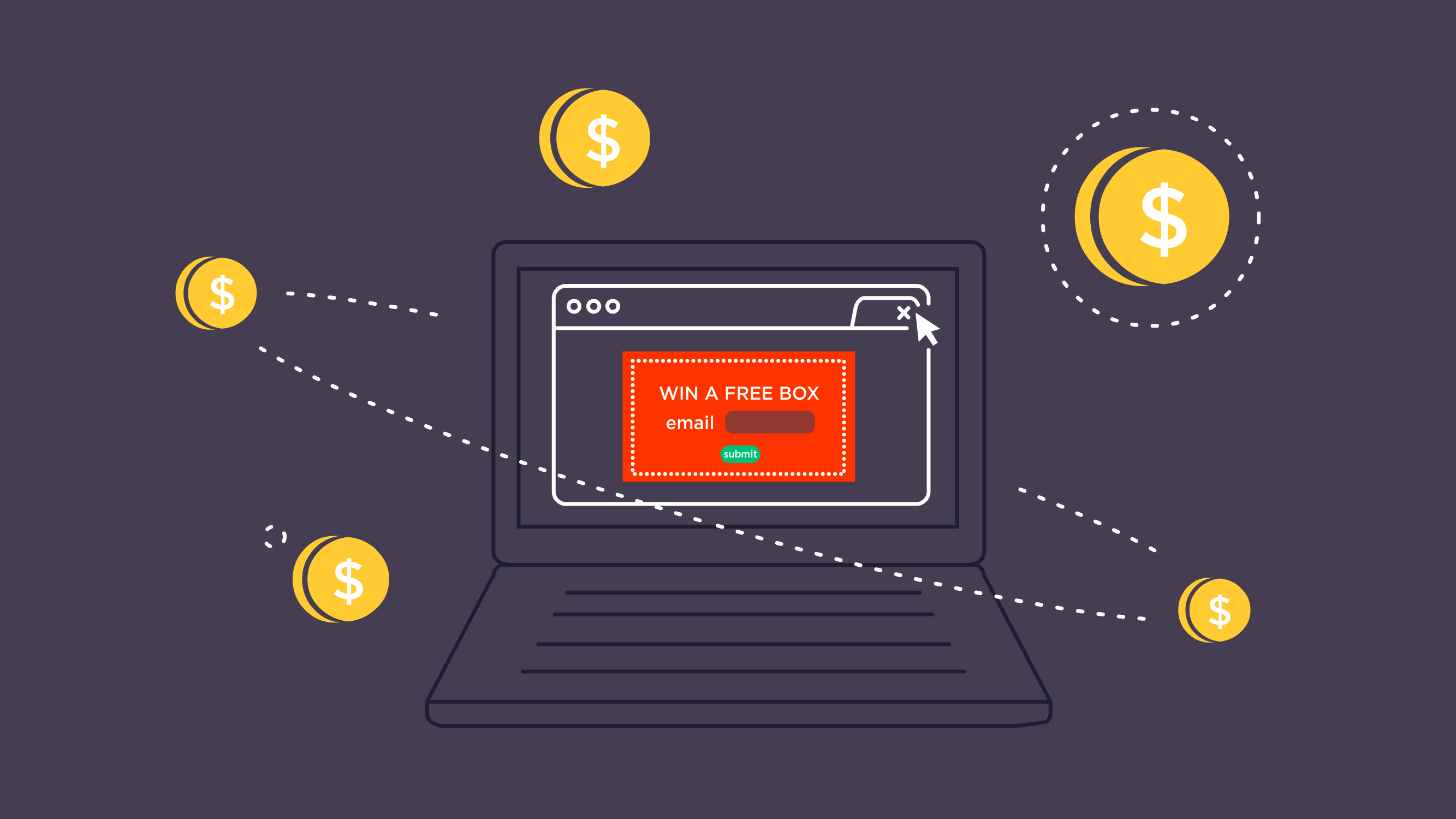
So, where do you start first? Building an email list with GrooveJar of course, a set of customizable pop-ups to help build an initial email list.
Alright, you may be thinking pop-ups have a bad name. The first thing that comes into mind may be the excessive annoying spam pop-ups used to solicit and advertise. Here at GrooveJar our pop-up apps are NOT annoying or out-of-place. They’re also not affected by Google Chrome’s ad-blocking.
Capturing subscribers is essential for any growing e-commerce business. Who are you going to send email campaigns to without any emails? And how are you supposed to create custom audiences for Facebook Ad retargeting?
We’re going to highlight effective exit-intent email capture forms using GrooveJar. Take note of these pop-ups, we hope these will inspire you to create an even better looking pop-up with GrooveJar.
Maid Cleaning Service
Let’s start off clean by highlighting one of our users who happens to be in the maid industry. They offer professional cleaning services to homes and businesses. Check out their pop-up below!
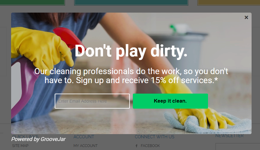
Why do we like it?
One thing that makes GrooveJar’s pop-ups effective is the ability to not make it look out of place. Often pop-ups will look like they don’t belong and get exed-out. This one is in line with their brand and offering, maid services.
The use of “Don’t play dirty” as a headline captures the attention. It’s a well-known phrase often used in sports. They also customized their submit button to say “Keep it clean” often a phrase said after “Don’t play dirty” in sports. It’s the attention to details is why we like it!
How is it effective?
It conveys the message quickly by highlighting they’re not just a maids company, they’re a company that has cleaning professionals. The background image is is colorful, yet the text is easy to read.
Often times, people get carried away with designs. Sometimes keeping it clean and simple is effective. And that’s key, as the other pop-ups we highlight exemplify this too.
World Travel Agency
In the screenshot below this pop-up is used for a travel agency. When the visitor/browser is about to leave the site, they’ll receive this pop-up to enter in their information. GrooveJar’s exit-intent technology knows when a visitor is about to ex-out or go to the URL bar.

Why do we like it?
Not only is it visually appealing, but it also strikes a sense of happiness and nostalgia. When one thinks of vacation, most will think of being on a beach with white sands and crystal clear waters. The yellow font used, captures attention and pairs well with the beach background.
How is it effective?
If they’re on a travel site to begin with, they are most likely thinking about planning a vacation of some sort. The pop-up plays off of the visitors’ intent on booking a vacation, as a cherry on top, the travel company offers a 5% discount to help ease the cost.
Next up: Let’s take a look how this one e-commerce store who specializes in women’s clothing. They use the GroovePop when a visitor tries to leave the site, just like the travel agency.
Women’s Fashion E-Commerce Store
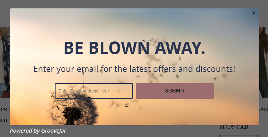
Why do we like it?
We love the tone of and background of this pop-up. The custom colors really go together and the message is clear and exciting. We love the dandelion background with the seeds being blown away.
Dandelions also have another meaning based off of superstitions; blowing the seeds may make wishes come true and/or bring romance into one’s life.
It’s also easily read without too much text or the background being too busy.
How is it effective?
This is effective because of the clear headline. By having “Be Blown Away” it implies that there are big things coming their way if they subscribe. It also doesn’t offer a discount code right away, but states they’ll be notified of the latest offers and discounts.
The company most likely has a great triggered email sequence to their subscribers for conversion. Using GrooveJar solely for growing their subscriber list.
Moving on we take a look at another e-commerce store, but they’re using a full-screen GrooveJar pop-up called GrooveSkin. Instead of showing a box, this pop-up makes more of a statement by taking over the full screen.
Cosmetics E-Commerce Store
Again, the common strategy with these e-commerce companies is the exit-intent email capture. Let’s take a look!
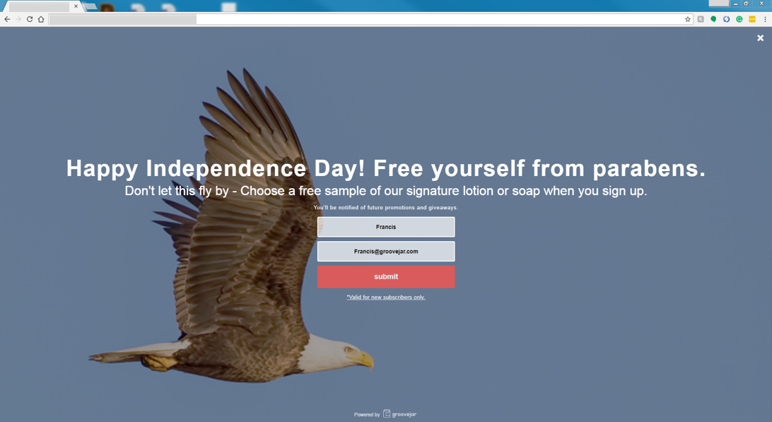
Why do we like it?
We absolutely love how this online cosmetics company used it around the Fourth of July, also known as Independence Day in the US. The wording plays off of the background picture, a soaring bald eagle, a symbol of the US.
How is it effective?
This cosmetics company who specializes in natural skin care and other products states “Free yourself from parabens.” This reminds the visitor what the brand is known for, and they even offer subscribers a free sample. It’s also engaging, attractive, and sends the message across without being too pushy and aggressive.
Also, by handing out a free sample the company is confident the visitor will like the product and come back.
A Baker’s Blog
Another example of an entire screen pop-up on exit-intent is from one of our users who run a cooking blog. To gain more subscribers they offer a free e-book when a user goes and exits the site.
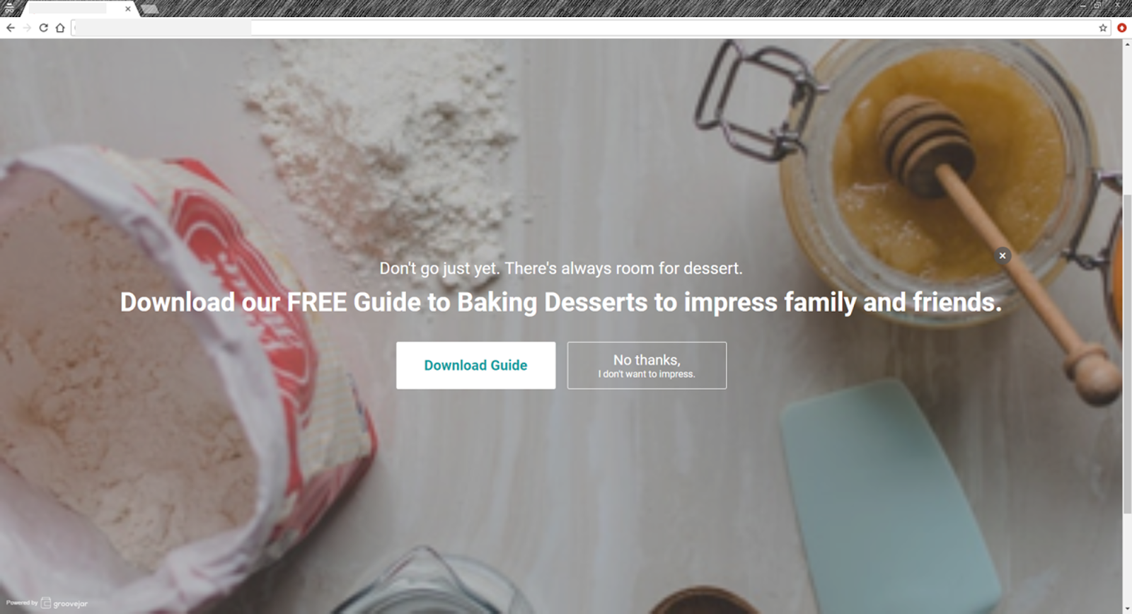
Why do we like it?
We love the background picture! It’s high-quality and it screams baking. When the visitor clicks on “Download Guide” it redirects them to a separate landing page where they confirm their email address. We also love the initial wording, “Don’t go just yet. There’s always room for dessert.”
How is it effective?
Often, when one visits a baking blog, they’re searching for a recipe of some sort. When the visitor visits the blog, they’ll often get what they need and leave, and possibly never come back.
To enhance brand awareness and be the go-to blog for baking, this GrooveJar user captures their information by providing a free Guide to Baking Desserts. This way they’ll be able to send out email notifications for new recipes, posts, e-books, and promotions.
The wording is also effective. They’re providing a free guide “to impress family and friends” with clear call-to-actions (CTAs). One to “Download Guide” and the other “No, thanks I don’t want to impress.”
Conclusion
When designing an email collecting pop-up using GrooveJar. The designs above from GrooveJar users show have many things in common that you should follow.
- Keep it clean and simple: too much going on can distract from the message and CTA. Don’t have a background that makes the text non-readable.
- Get creative: Many of these users played with their words and even used some humor. Of course, make sure it’s in line with your brand strategy. For example, if you’re a news site/blog that posts serious content, you wouldn’t want the pop-ups to display funky images or too much humor.
- Strategic trigger: All these users use GrooveJar’s exit-intent technology to know when a visitor is abandoning their site. In GrooveJar, you can set a pop-up only on a specific URL or to show on all pages.
Follow these users’ examples and you’ll be on sure on the right track to grow your target audience. Email is everything, so let’s begin!
No comment yet, add your voice below!